

The MTA’s Subway Design: A Modern Icon
An MTA Journey
Aboard any New York City public transit, one is bombarded with sensory experiences. The smells, the sounds, the surrounding bodies huddled over phones, books, or simply staring out into the open. More often than not, no one considers the subway lines or bus routes of the Metropolitan Transit Authority (MTA) art. One only tries to stay safe and get to their next destination. The hustle and bustle does not stop.
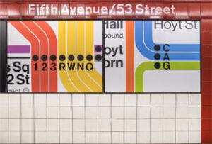
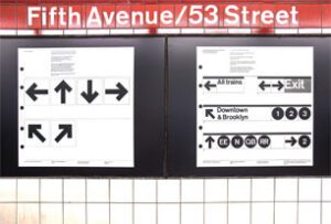
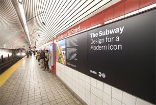
Gazing out into the space of the clear subway doors at the Fifth Avenue 53rd Street Station, something caught my wandering eyes. The MTA had recently installed an art display at the station closest to the Museum of Modern Art (MoMa). The display, titled The Subway: Design for a Modern Icon, features vinyl panels along the red tiled wall of the station.
The Subway: Design for a Modern Icon
There are over 70 panels that explain the iconic minimalist designs now so vital to the identity of New York City. From the black and white arrows, to the Helvetica font, and multicolored circles denoting distinct subway lines, the panels explain it all. There are quotations from the system’s primary designers, Massimo Vignelli and Bob Noorda, who worked under the graphics’ parent company, Unimark International.
Vignelli and Noorda were introduced to the then head of the New York City Transit Authority Daniel T. Scannell by MoMA curator Mildred Constantine in 1966. Other MoMA curators were involved with the project well into the 70s. The subway system illustrations we see today are part of the final product of graphic design work done in the late 20th century: The New York City Transit Authority Graphics Standards Manual. This is the modern bible for the work done to create what we all experience aboard a train or bus.
Today, the MoMA’s graphic design team has remained close to the MTA’s project planning department. MoMA curators Juliet Kinchin and Andrew Gardner teamed up with the MTA’s Sandra Bloodworth to bring this installation to fruition.
The installation represents a longstanding relationship between public infrastructure of NYC and the arts. Next time you listlessly await the arrival of the E or M train, look behind you. There is much to be said about the history of the otherwise dingy flooring and tinted signage of the system that keeps this city’s heart beating.