

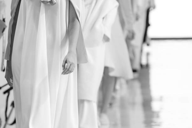
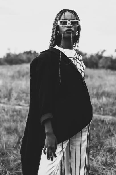
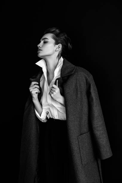
Monochromatic Fashion Is The Industry Archetype
Monochromatic fashion has existed in a plethora of idioms throughout fashion history, but minimalism and quiet luxury have further established the design philosophy as the new industry archetype. The appeal lies within the simplicity, sophistication, and versatility of muted tones, as well as the aesthetic. But the escalating absence of color in fashion begs a viable query: Is the industry going dark?
Designers have been playing it safe with fashion for multiple seasons at this point, which coincides with some recent color theories and studies regarding how there seems to be a lack of color in society today. Simplicity has transcended just high fashion runways, becoming favored by many consumers in search of subtle glamour. Fleeting trends can be unpredictable from season to season, but minimalism is universally timeless.
The industry’s willingness to take risks with color is more prevalent in high fashion, but it’s worth noting such designers have become less likely to do so; this has also trickled down to the logos for some luxury brands. Original logos for multiple luxury brands formerly were distinguishable from one another based on some color, font usage, and motifs. Monograms such as Burberry’s knight riding a horse or Coach’s horse and carriage were indicative of the brand identity and differentiated them in the marketplace. The shift from this to an understated aesthetic limits a brand’s competitive nature. If all branding and brand identity is one in the same, differentiation is insular, and innovation is overshadowed by the fixation of competition.
With minimalism being the norm, it’d be remiss not to consider the potential drawbacks of a solely monochromatic approach to fashion and dress. An exclusive fixation on this fails to properly depict a proper representation of what the fashion industry’s artistry has to offer. While fashion is subjective to the naked eye, monochromatic fashion has been interpreted by some as overly somber – in favor of a wider range of color. To pacify such, a balance of minimalistic chic as well as the use of color must be universally accepted by the industry to the same degree.
Featured Image Courtesy of iStock